May 15, 2024
How to add a Call-to-Action (CTA) to your website?
Access the Component Builder
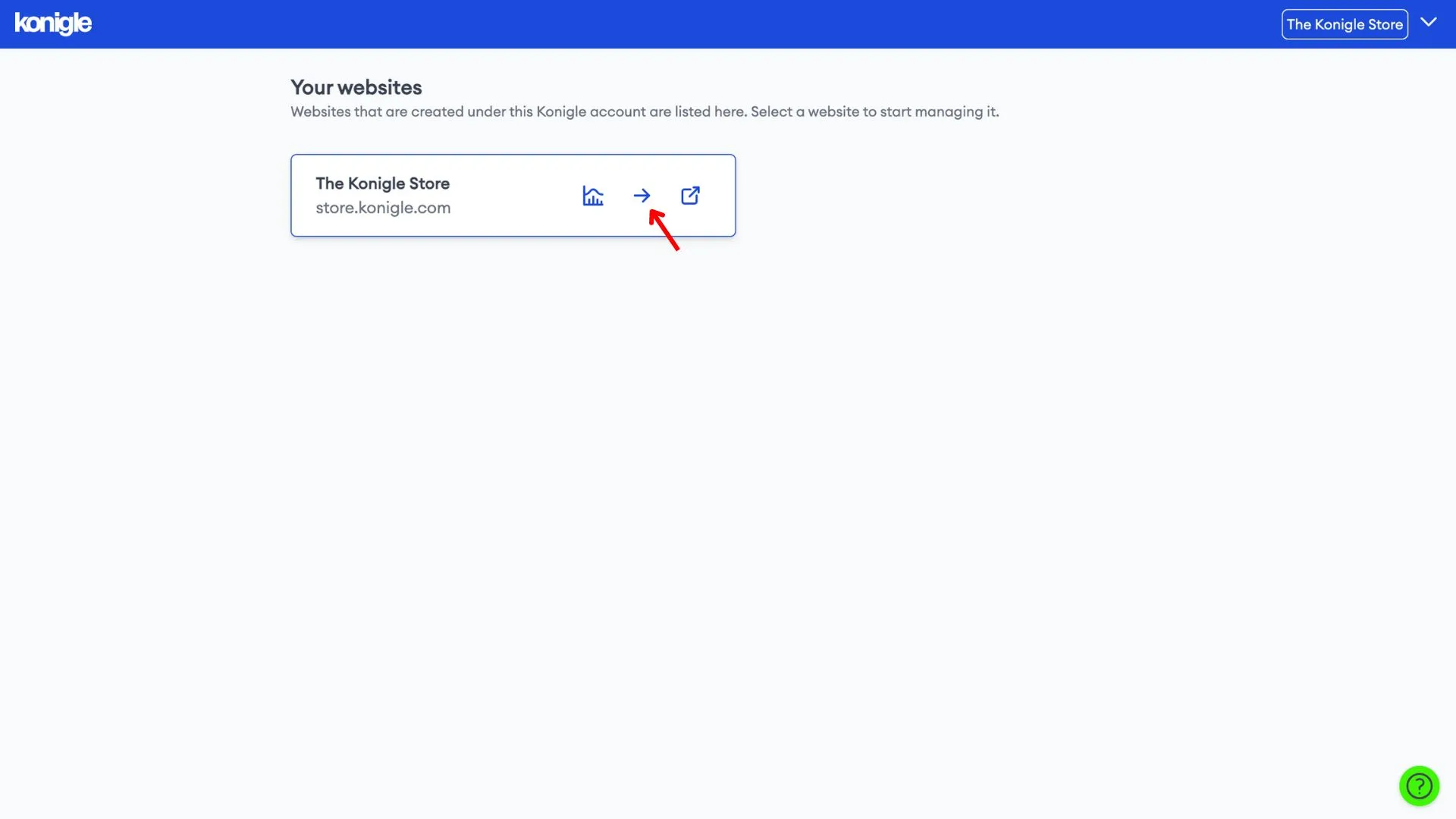
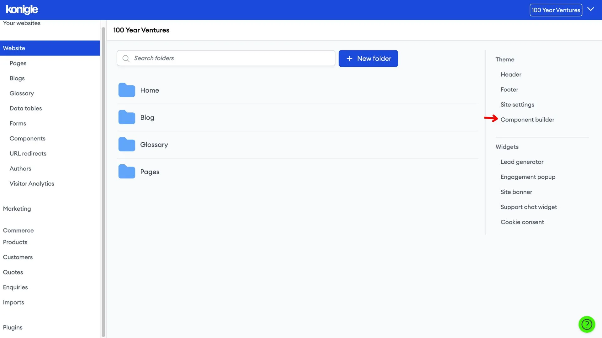
1. Select the website you wish to edit and go to the component builder.
Create a Call-to-Action (CTA)
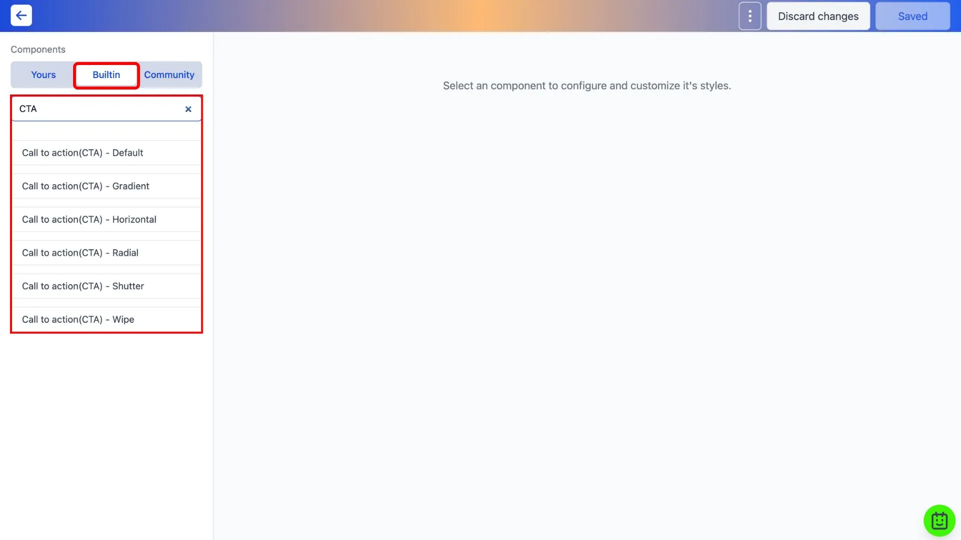
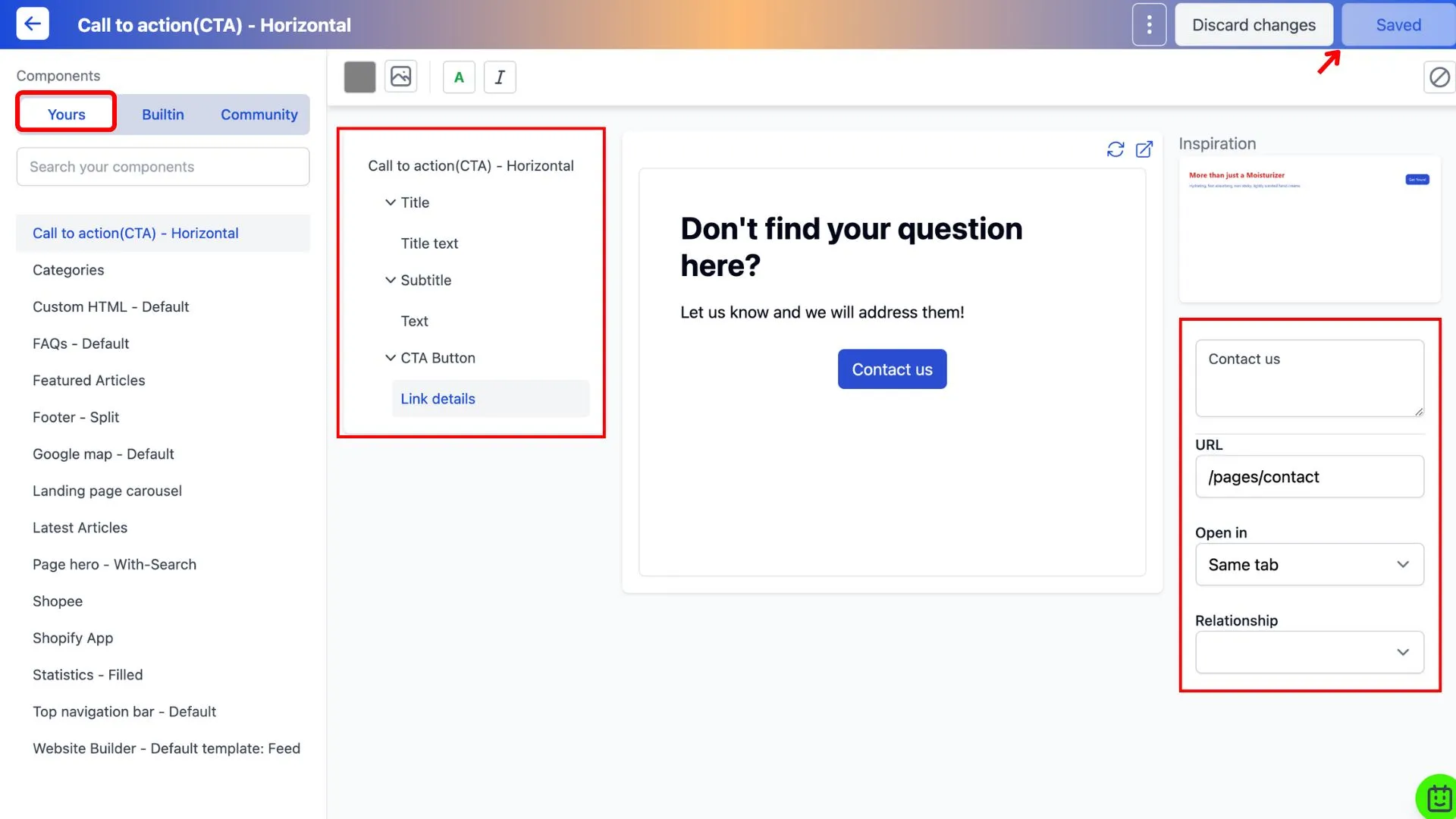
1. Under the Built-in tab, search for CTA. You will see a variation of differently styled CTAs.
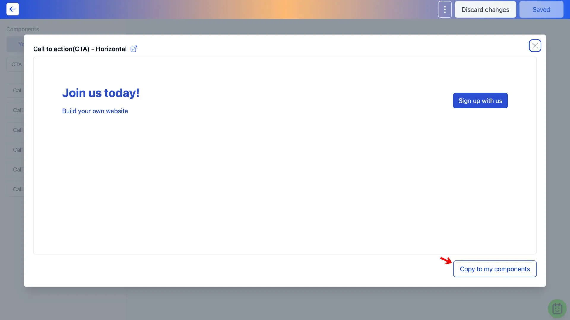
2. Copy the preferred CTA to your components.
3. Go to the Yours tab to edit the copied CTA component. Remember to save after you're done.
Add a Call-to-Action (CTA) to website
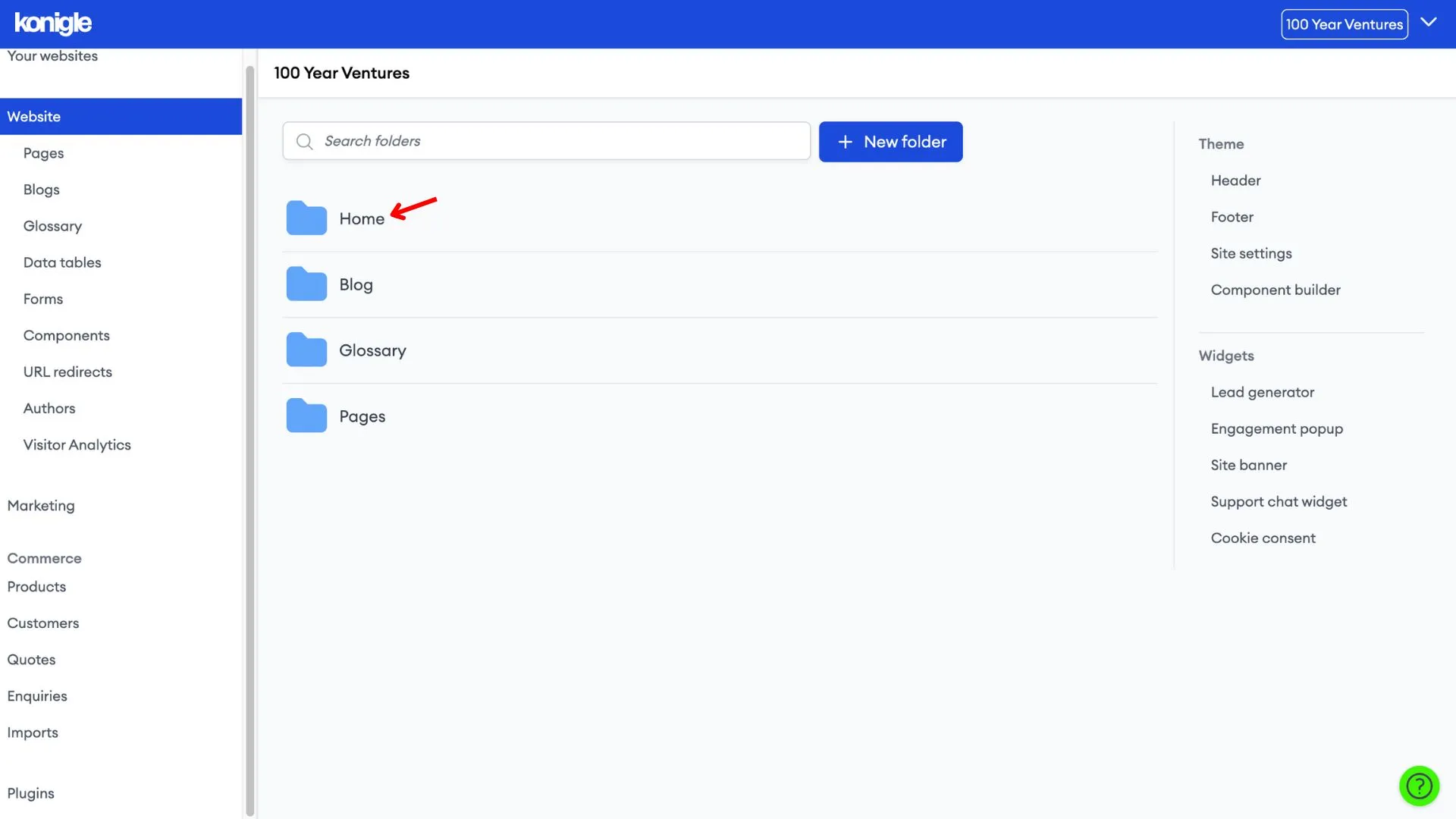
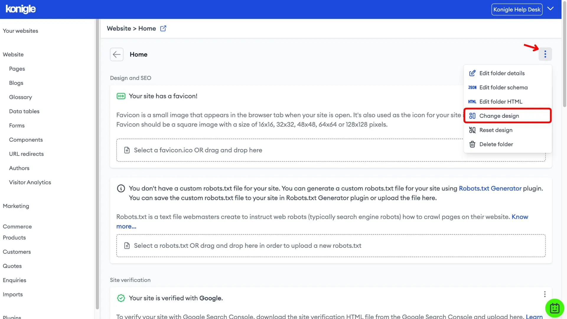
1. Exit the component builder and go to the folder you wish to add your CTA to. In this guide, we will add the CTA to the landing page.
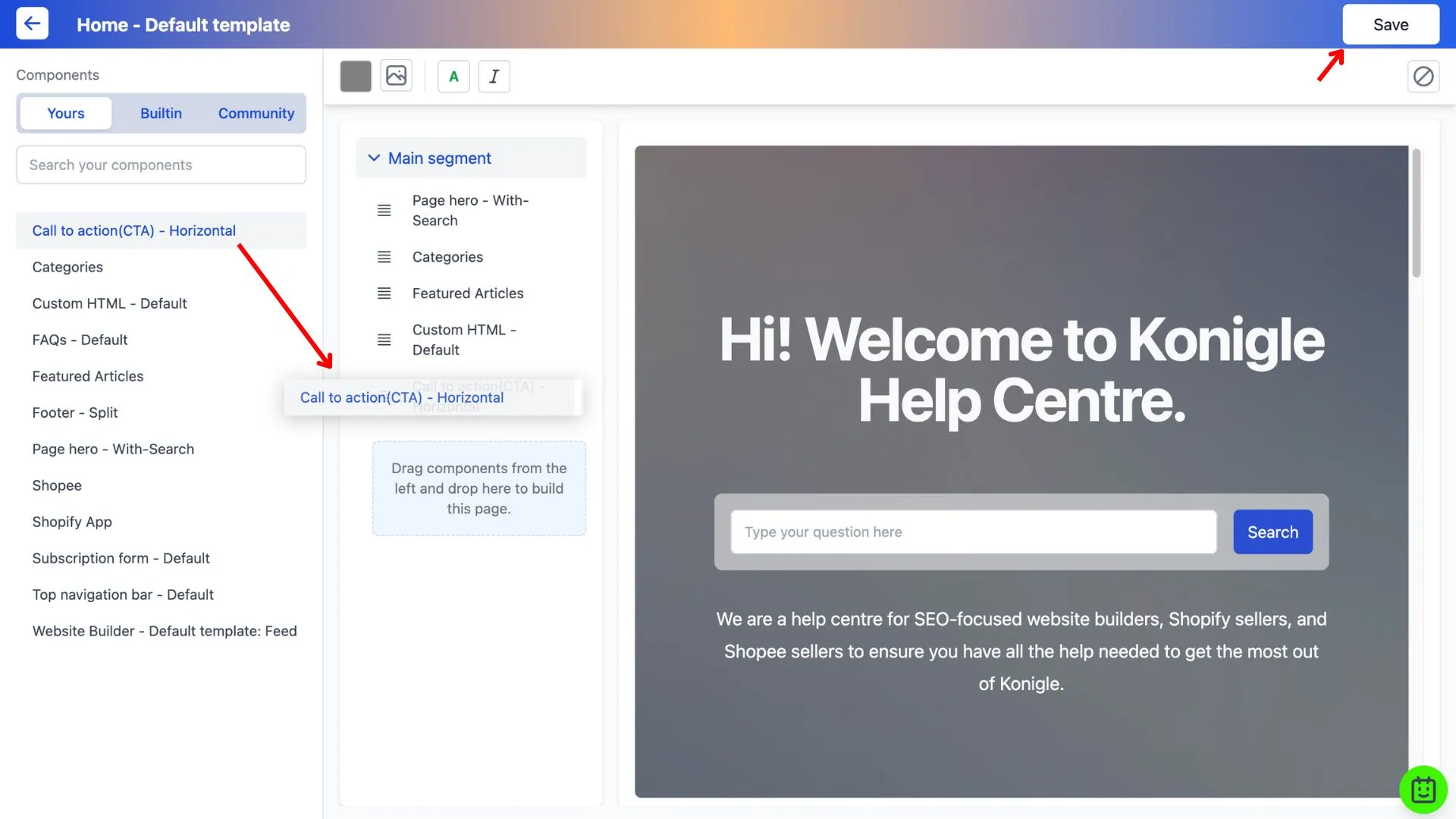
2. In the page builder, drag and drop the created CTA component to add it to your landing page. Save to finalise the changes made.
Here's a video tutorial on how to add a CTA to your website:
Link Text Best Practices for CTA buttons
The link text should clearly communicate the destination of the hyperlink. Generic text that offers insufficient information to users or search engines, such as "See More" or "Learn More," should be avoided as it can negatively affect the SEO score of your website.
Frequently Asked Questions (FAQs)
What is an example of a CTA button?
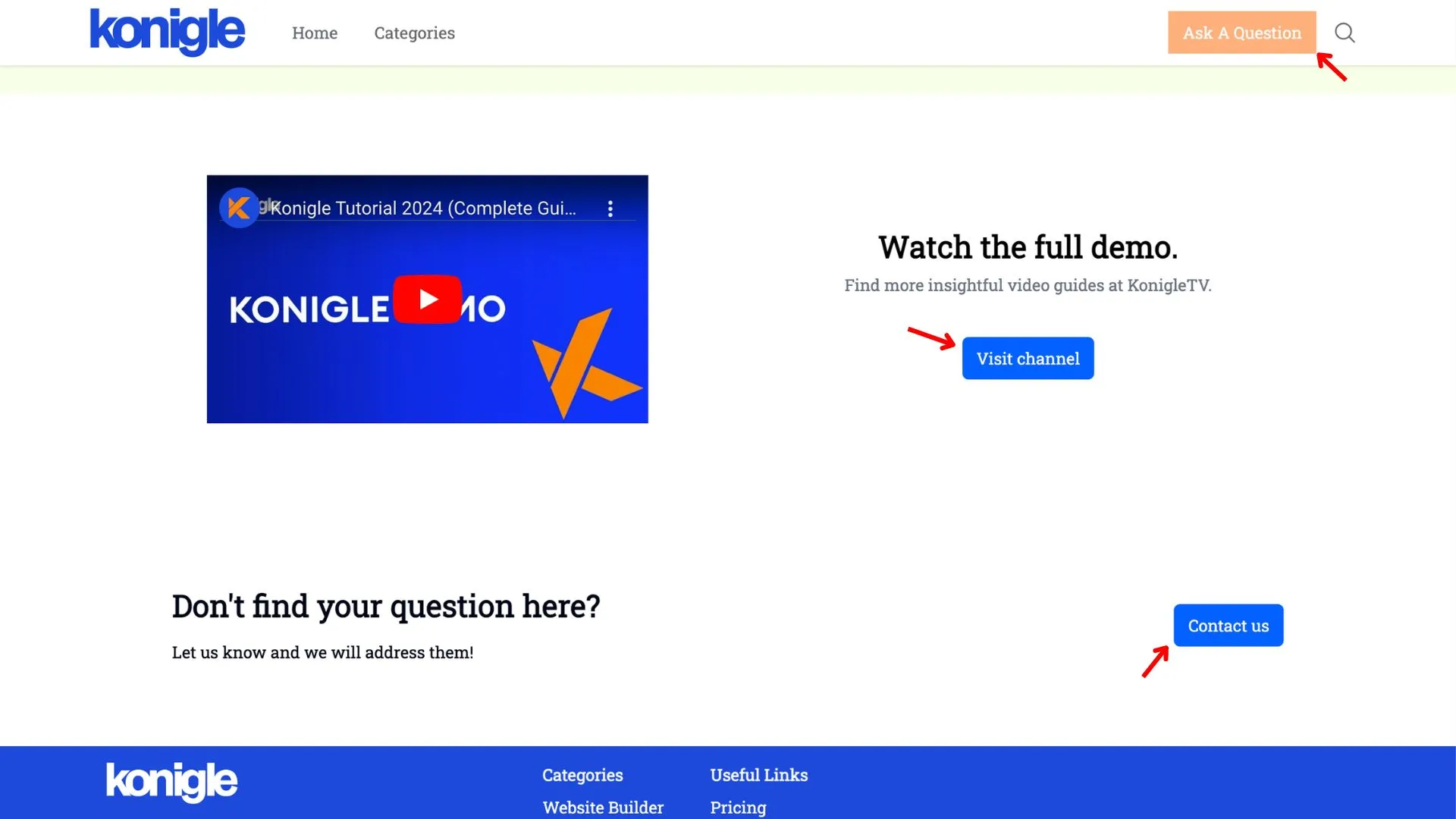
Here's an example of CTA buttons on a website:
How to design an effective website call to action?
Designing an effective CTA is crucial for guiding visitors towards taking the desired action on your website. Here are key elements for an effective CTA design:
- Use strong verbs that clearly communicate what you want visitors to do. Examples include "Download," "Subscribe," and "Buy Now,".
- Highlight the benefit users will receive by taking the action. Focus on solving their problems or fulfilling their needs.
- Create a sense of urgency to encourage immediate action. You can mention limited-time offers or use phrases like "Don't miss out!"
- Make your CTA button stand out from the surrounding content. Use contrasting colors, whitespace, and a clear button design.

