April 7, 2024
Website Theming Guide
Theming your Konigle website is made very simple. It just involves configuring few colours, fonts and border rounding.
Configuring colors
Konigle provides few semantic colors to theme your website. The colors can be configured under Website > Site settings > Brand and theme
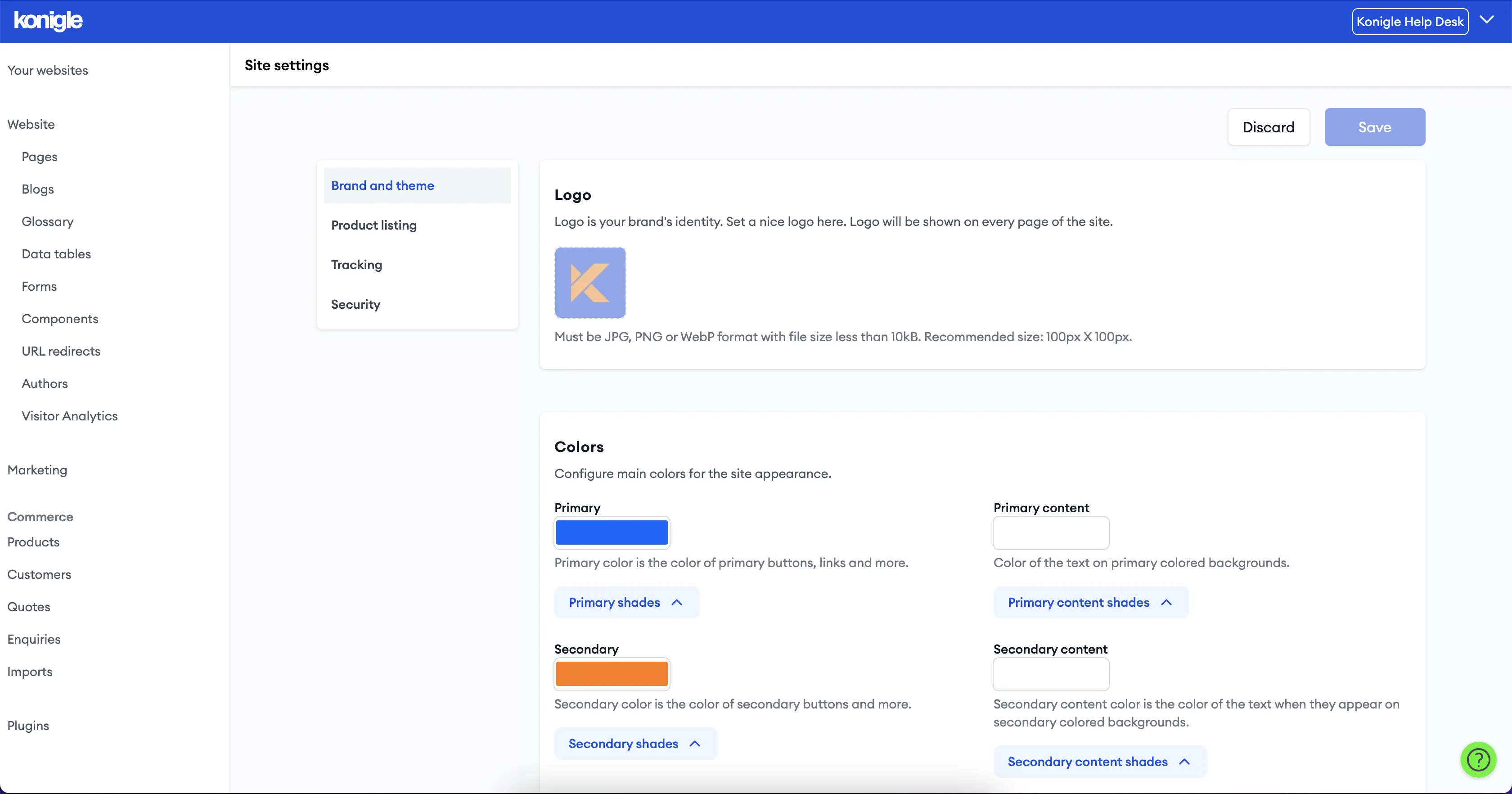
Below are the supported colours with details.
- Primary - Primary color is the main brand colors. It is used to style key elements like buttons. Class suffix to use when using in Tailwind styled HTML component: "primary". Example: kn-text-primary, kn-bg-primary. This color offers shades - 50, 100, ... 900, 950.
- Secondary: Secondary color is used to style elements that require user focus but no primary focus. Class suffix to use when using in Tailwind styled HTML component: "secondary". Example: kn-text-secondary, kn-bg-secondary. This color offers shades - 50, 100, ... 900, 950.
- Page background: This is the background color of the website's every page. Tailwind class suffix - base-50. It provides 3 more shades - base-100, base-200, base-300
- Page text: Default color of the text on the page. Tailwind class suffix: base-content. Make sure this color stands out on the page background and its shades making the text readable.
- Neutral: Color of the neutral backgrounds. Tailwind class suffix: neutral
- Neutral content: Color of text present on neutral background. Tailwind class suffix: neutral-content
- Accent: Color of backgrounds that require immediate user attention. This can be used for elements like banners. Tailwind class suffix: accent
- Accent content: Color of text present on the accent background. Tailwind class suffix: accent-content
- Info: Color of background that is used to show informative messages to the user. Tailwind class suffix: info
- Info content: Color of text present on the info background. Tailwind class suffix: info-content.
- Success: Color of background that is used to show success messages to the user. Tailwind class suffix: success
- Success content: Color of text present on the success background. Tailwind class suffix: success-content
- Warning: Color of background that is used to show warning messages to the user. Tailwind class suffix: warning
- Warning content: Color of text present on the warning background. Tailwind class suffix: warning-content
- Danger: Color of background that is used to show error messages to the user. Tailwind class suffix: danger
- Danger content: Color of text present on the danger background. Tailwind class suffix: danger-content
Configuring border rounding
Rounding of various elements like buttons, cards can be done under Site settings. Below rounding configurations are available for Konigle websites.
- Button: Rounding of the various buttons on the website. This can be specified in any of the CSS units (px, rem, em). Tailwind class suffix: btn. Example: rounded-btn.
- Box: Rounding of various box kind of elements like cards, blog list item etc. Tailwind class suffix: box. Example: rounded-box.
- Input: Rounding of form's input elements. Tailwind class suffix: input. Example: rounded-input.
Frequently Asked Questions (FAQs)
What is website theming?
Website theming refers to the pre-designed templates that determine a website's visual style. Think of it as the outfit for your website, including colors, fonts, layout, and overall feel.
Why is it important for the website to look thematic?
A thematic website is crucial for two main reasons: Branding and User Experience (UX).
- Branding: A theme reinforces your brand identity by creating a consistent visual experience that aligns with your brand image.
- UX: A thematic website is easier to navigate and use. Visual consistency helps users find information intuitively, keeping them engaged.
Be first to comment
